

Colours influence our emotions and mood in a number of surprising ways. According to colour psychology, the right paint shade may enhance productivity, promote calm, boost creativity levels and even increase your appetite.
We dug a little deeper to unlock the meaning behind your favourite paint colours and the rooms they work best in. Keep in mind, it’s not just colour that makes an impact; the intensity of the shade is also important.
Bedroom
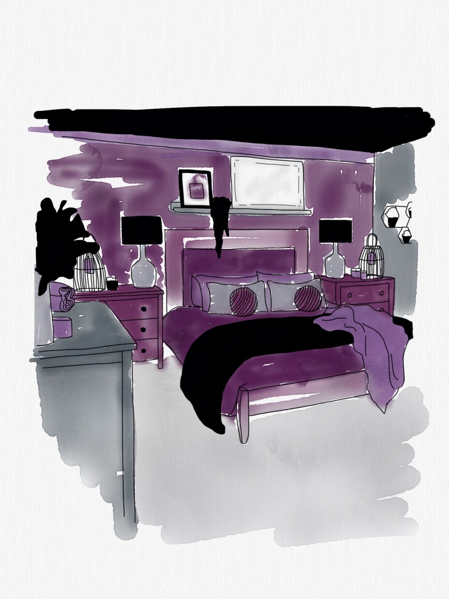
Your bedroom is your oasis. If relaxation is your goal, you’ll want to opt for soft, soothing colours—lavender, soft green or pale blue. Purple and blue are said to be stress-reducing shades. While deeper tones can often be intense on your walls, a muted amethyst or powder blue keeps things calm and cool. A neutral palette also works well in a bedroom, since you can always change out your décor accents to suit your mood. If you love bold colours like red or yellow, use a muted shade and opt for an accent wall instead of an all-red bedroom.
Kitchen
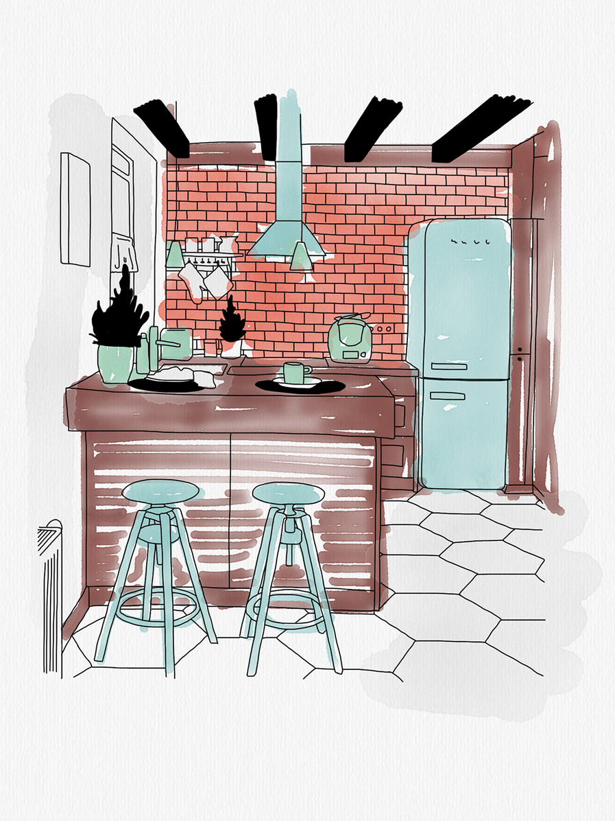
It’s no surprise Martha Stewart is singing the praises of warm tones for this high-traffic area, as they’re said to have a comforting effect. Red and orange are incredibly versatile and are thought to stimulate the appetite. This year, make way for terracotta and dusty rose—these kitchen-friendly colours are making a comeback.
Living room
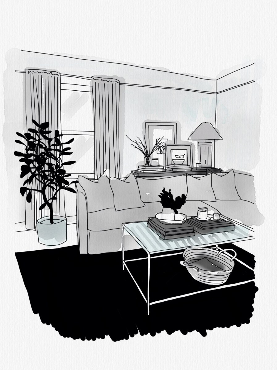
Grey is a popular neutral for any room but looks particularly elegant in the living room. Grey is a safe bet, since it’s versatile and will go with most styles of furniture, so you won’t have to repaint even if you redecorate. Lighter hues will make your room seem bigger, while darker greys can add drama. Grey works fabulously as a backdrop for Scandinavian, Industrial, Urban Modern and Minimalist designs.
Office
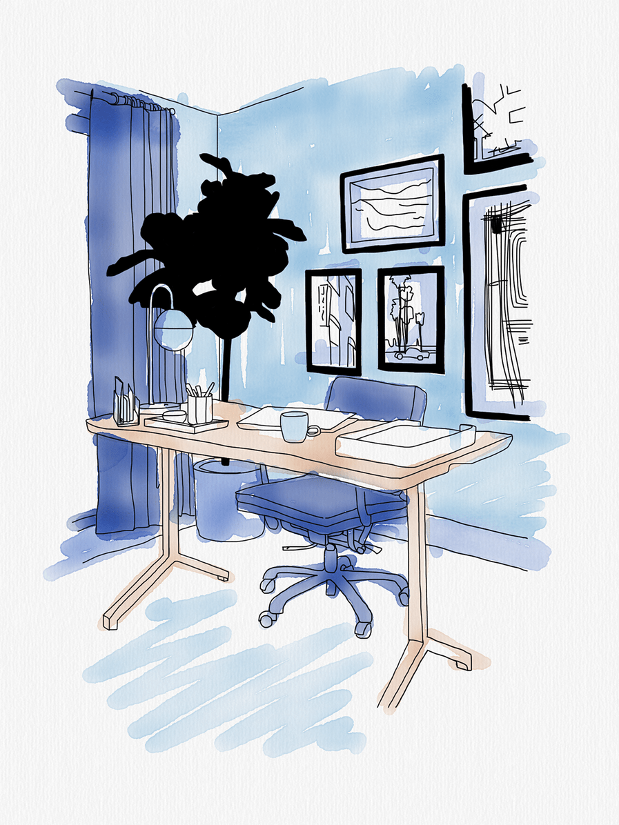
Blue is an intellectual colour, representing trust, logic, communication and efficiency. Green works great for an office, too, promoting calmness and concentration. Use blue or green as the primary colour in your office area if you require intense focus. If you’re looking to spark creativity, however, yellow is your friend. Yellow is an emotional hue, representing friendliness, optimism and inspiration. Not brave enough to highlight all four walls? Choose one as a focal point, ideally the wall your desk will face. Remember, you can play with the shades–your space doesn’t need to be all-over neon.
Kids’ room
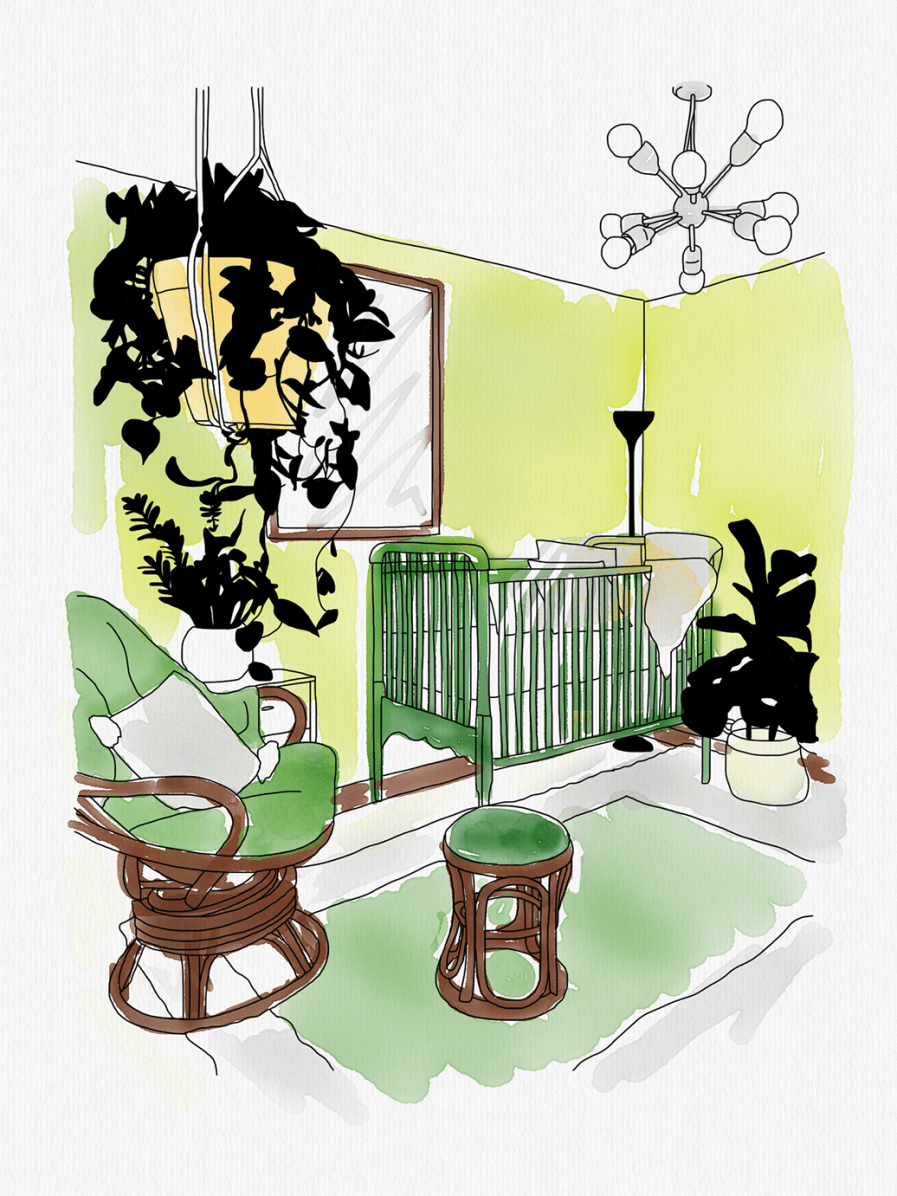
Kids are extra sensitive to a colour’s psychological effects and green in particular may have a calming, soothing impact. We recommend involving your children in the process and letting them choose a colour that speaks to them (within reason). They generally have great intuition about how certain colours make them feel. Avoid using wall-to-wall red in a baby’s room and save it for accents only, as it can be overstimulating.
Bathroom
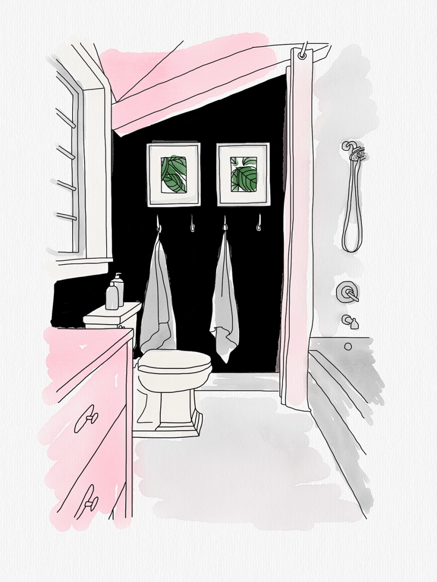
The best way to make any bathroom appear larger is to use light colours. Play with happy, pastel colours like yellow and pink, don’t be afraid to mix in some bright wallpaper as well. In small doses, pink has a calming effect but, if overused, can lead to irritation.
Of course, paint colours are highly personal and should complement your existing furniture, lighting and taste. There are no “wrong” colours when it comes to designing your home. The best hues are the ones that speak to you.
Post a comment